
This blog post will talk about the recent UI/UX changes that happened in the rustdoc tool. As a reminder, rustdoc is the tool which generate the documentation for Rust source code. You can see previous UI/UX changes in this previous blog post.
Now let's go through these changes!
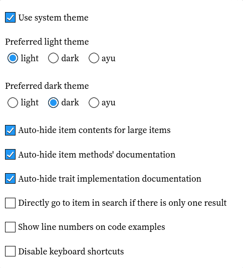
Until recently, the system theme selection was a toggle on its own, making it a bit confusing and more complex than necessary:
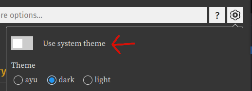
When it was toggled, it made the "theme" entry disappear to replace it with two others, adding up to the confusion:
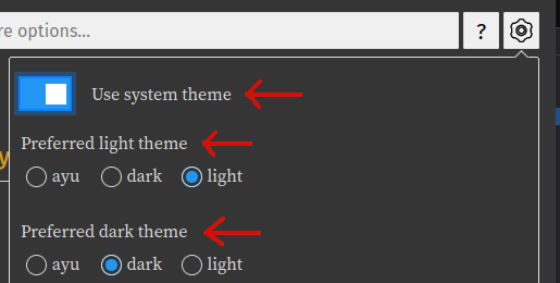
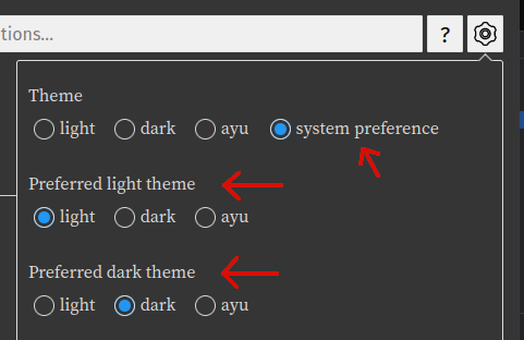
In this pull request, it was merged with the other themes to become a "normal" option:

So when selected, it doesn't make the "theme" entry disappear anymore while still displaying the two new entries:
The toggles in the settings popover were visually more complicated than necessary. They were simplified in #104267.
Before:
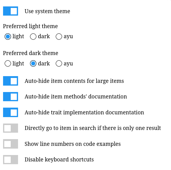
After:
Until #103296, both + and - shortcuts could both collapse and expand all items. Now, + only expands items whereas - only collapses items.
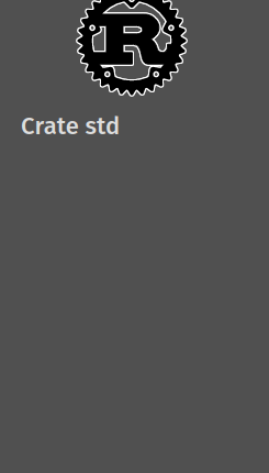
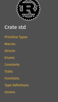
Before #102054, the "all items" pages didn't have anything in their sidebar except the crate name. Now, it contains the different sections present in the page, just like all others pages.
Before:
After:
On source code pages, it was annoying before to share a link of a source page targetting a given line. Since the line numbers are now links, you can directly share it using the links' associated actions (like "copy link" after right click on it).
It was done in #103650.
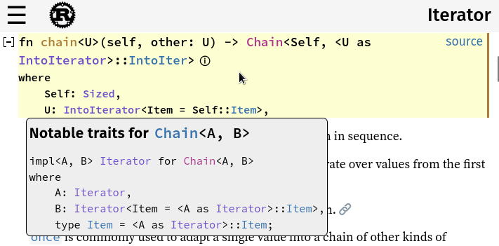
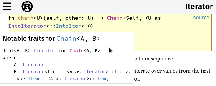
Since the help and settings menu are now popovers (with a little arrow pointing to the element where they come from), it was only logical to also do it for the notable trait popover. It was done in #104177.
Before:
After:
Elements such as impl block's associated types didn't have the same margin as methods. It was fixed in #103793.
Before:

After:

The search bar and the buttons were weirdly aligned. #103321 fixed it by centering them between the top of the page and the top of source code content.
Before:

After:

#103060 created a help page which contains the content of the help popover at the /help.html location. It allows you to now navigate to the help page if you want by using the usual links interactions (opening in a new tab for example) with the ? button:

In #104772, we fixed some accessibility issues by adding a aria-label (it's an attribute in which you put a small description of what the item is) on the search input. We also moved the anchors out of the CSS directly in the HTML so the text is always present directly into the DOM.